Whirl - Final Exam Project

This is our final exam project. We decided to create a new project from skratch.

How can a digital app support people with anxiety in creating structure and improving mental well-being in their everyday lives?
How can we develop a user-friendly app that, through a combination of a chatbot, a planning tool, and well-known anxiety management methods, helps people with anxiety gain an overview and enhance their mental well-being while also taking into account users' sense of safety and the ethical challenges of digital support.
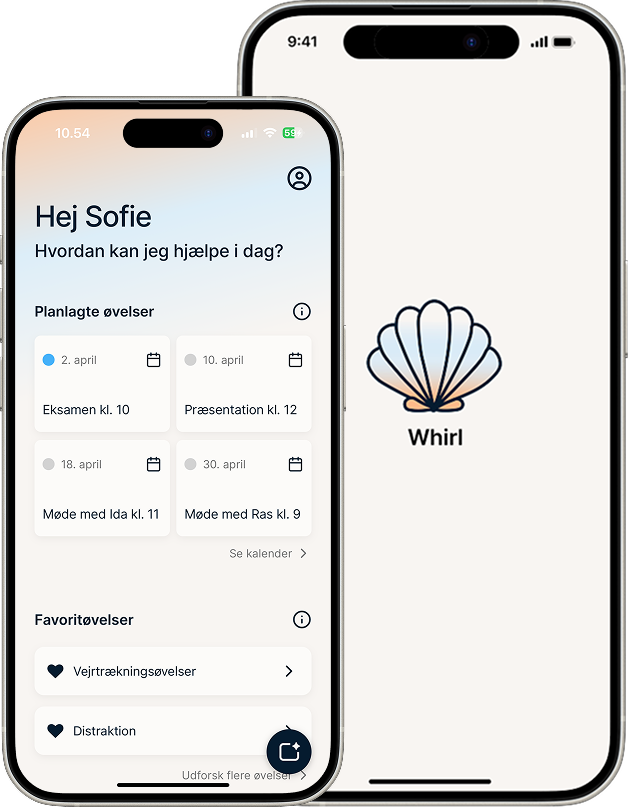
Photo Manipulation UX UI Brainstorming Marketing Project Management Value Enhancement

The Problem

How can a digital app support people with anxiety in creating structure and improving mental well-being in everyday life?

An estimated 350,000-400,000 Danes are believed to experience symptoms of anxiety. Access to professional help is limited and waiting times are long, and most existing apps are in English and require payment. We saw an opportunity for a free, Danish, and empathetic solution.

Research in Numbers

What Did the Data Tell Us?

Danes with Anxiety
7-10%
of the Danish population is estimated to experience symptoms of anxiety
Waiting Time for a Psychologist
14 weeks
on average in the public psychological care system, up to 26 weeks for young people
Survey Respondents
28
participated in the quantitative study on digital support for anxiety management
Primary Target Group
18-34 years
digital natives with high expectations for apps and low willingness to pay

The Concept

Your Everyday Life,
Made a Little Easier.

Whirl brings three things together in one app: a supportive chatbot for reflection and calm, a planning tool that helps create structure in everyday life, and saved favorite exercises always within reach, from 4-7-8 breathing to grounding techniques.

The design is built on color psychology and WCAG guidelines. A palette of cream, blue, and orange tones creates a sense of calm and balance, appealing to a broad audience without feeling clinical or heavy.

The Design Process

From Idea to Prototype

An iterative process driven by research, user involvement, and continuous reflection, from FigJam workshops to a Figma prototype.

01
Ideation

Brainstorm workshop

The process began with a structured ideation workshop in FigJam. The group brainstormed individually for two minutes per question, after which we shared and grouped ideas using affinity diagramming.

Dot voting with four votes per person helped us narrow down and prioritize ideas. Patterns clearly pointed toward mental health, AI, and the desire to create something meaningful, and Whirl was born.

FigJam brainstorm workshop med affinity diagramming og dot voting
FigJam workshop — brainstorm, affinity diagramming, and dot voting
02
Structure & Layout

Sketches & Lo-fi Wireframes

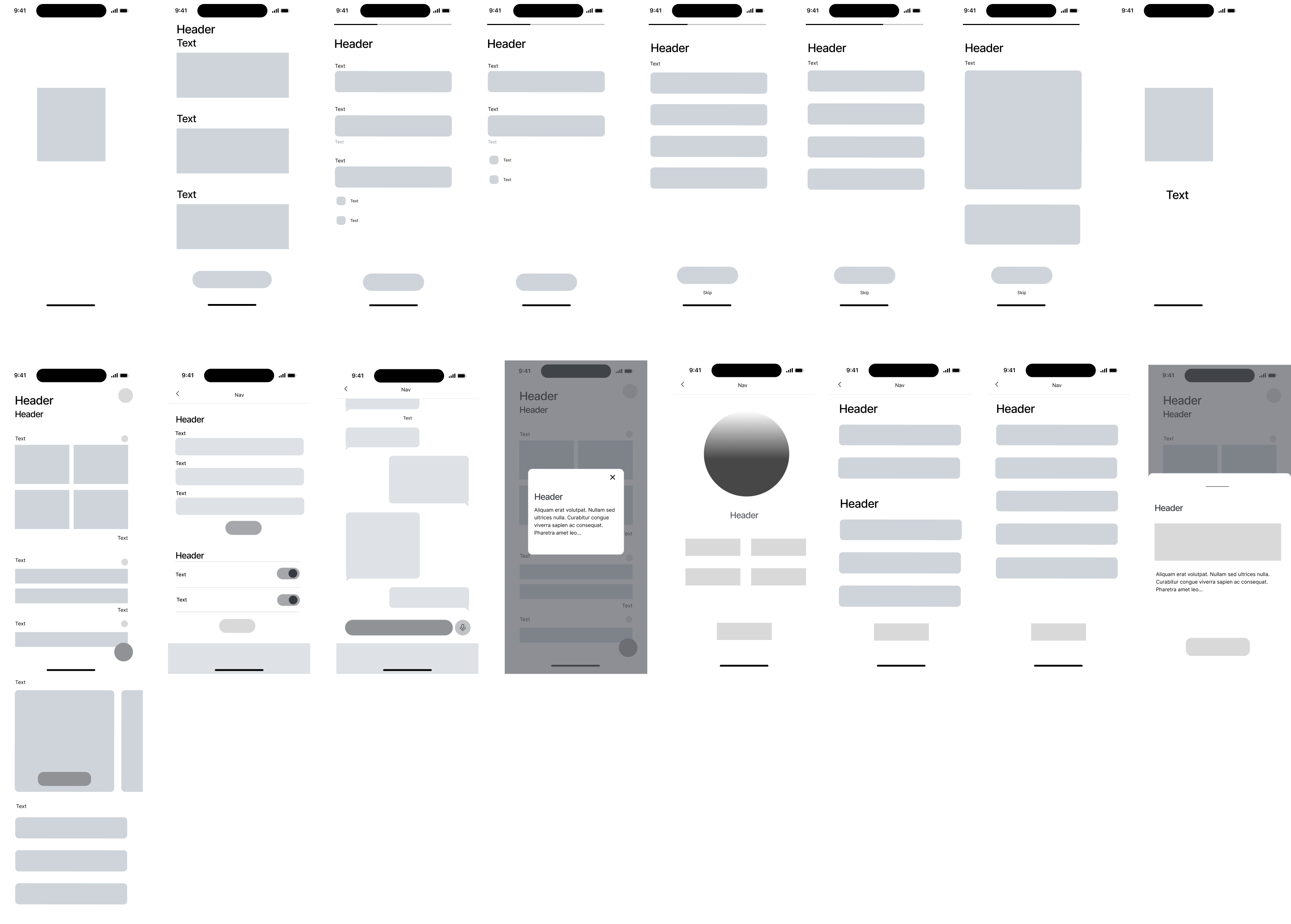
Before opening Figma, we sketched app screens, the landing page, and content on paper. This gave us the freedom to quickly test placements for navigation, call-to-actions, and dashboard layouts.

Lo-fi wireframes in Figma built upon the sketches — simple, grayscale, and without design details. This kept the focus on structure and user flow rather than aesthetics. Both a first and revised version were created, as user interviews and user journey work changed the flow.

Lo-fi wireframes af Whirl-appen
Lo-fi wireframes of the app — first iteration
03
User Understanding

User Journey Map

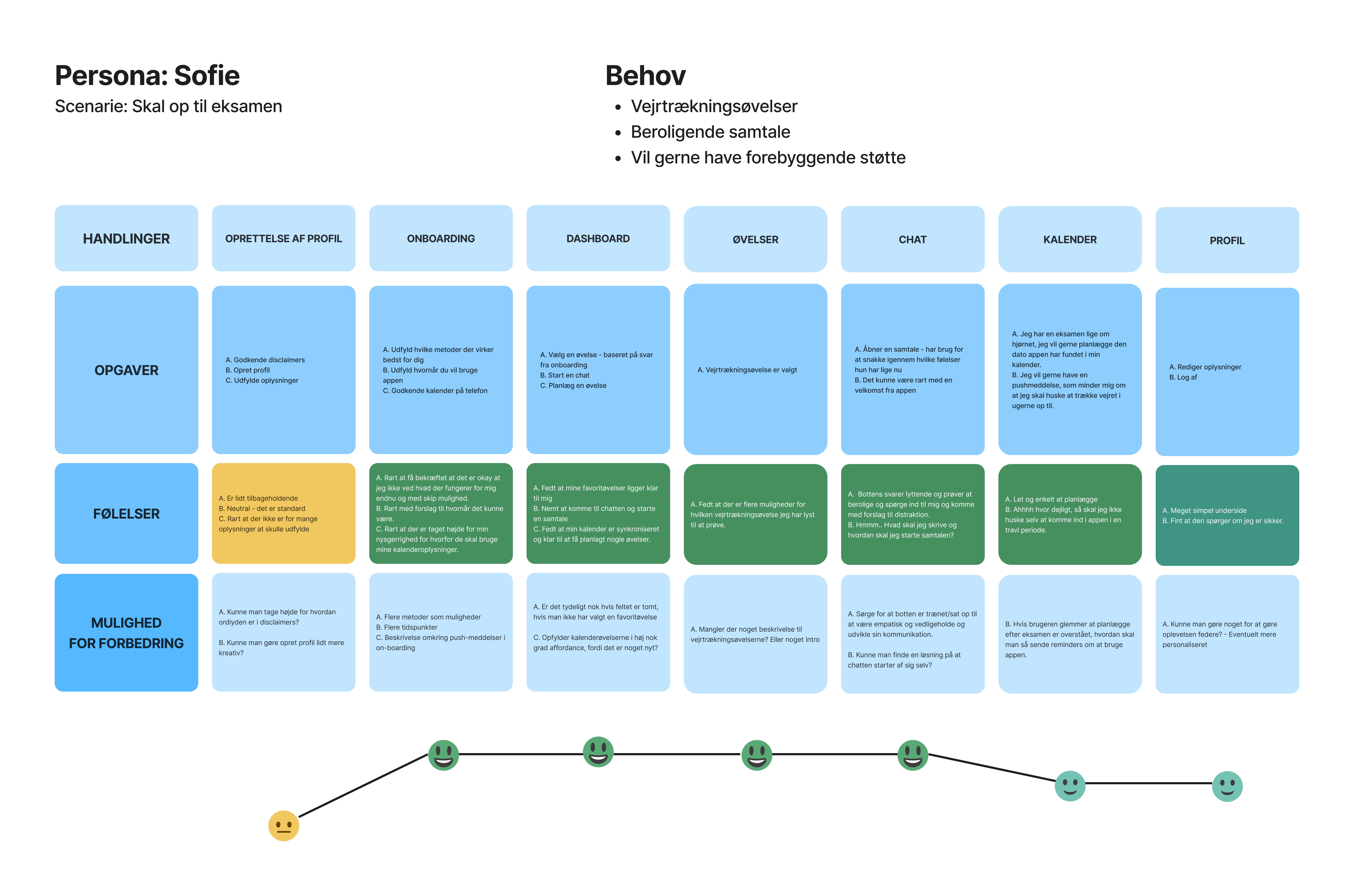
Based on the persona Sofie, who is preparing for exams and needs breathing exercises and calm, we mapped the user's journey from first launch to completing an exercise.

The first version turned out not to align with the actual needs revealed in the user interviews. We revised the phases to: profile creation, onboarding, dashboard, chat, favorite exercises, and planning. This insight directly led to exercises being given a permanent place on the dashboard.

User Journey Map version 1 og 2
User Journey Map — version 1 and revised version
04
Navigation & Flow

Flowchart & wireflow

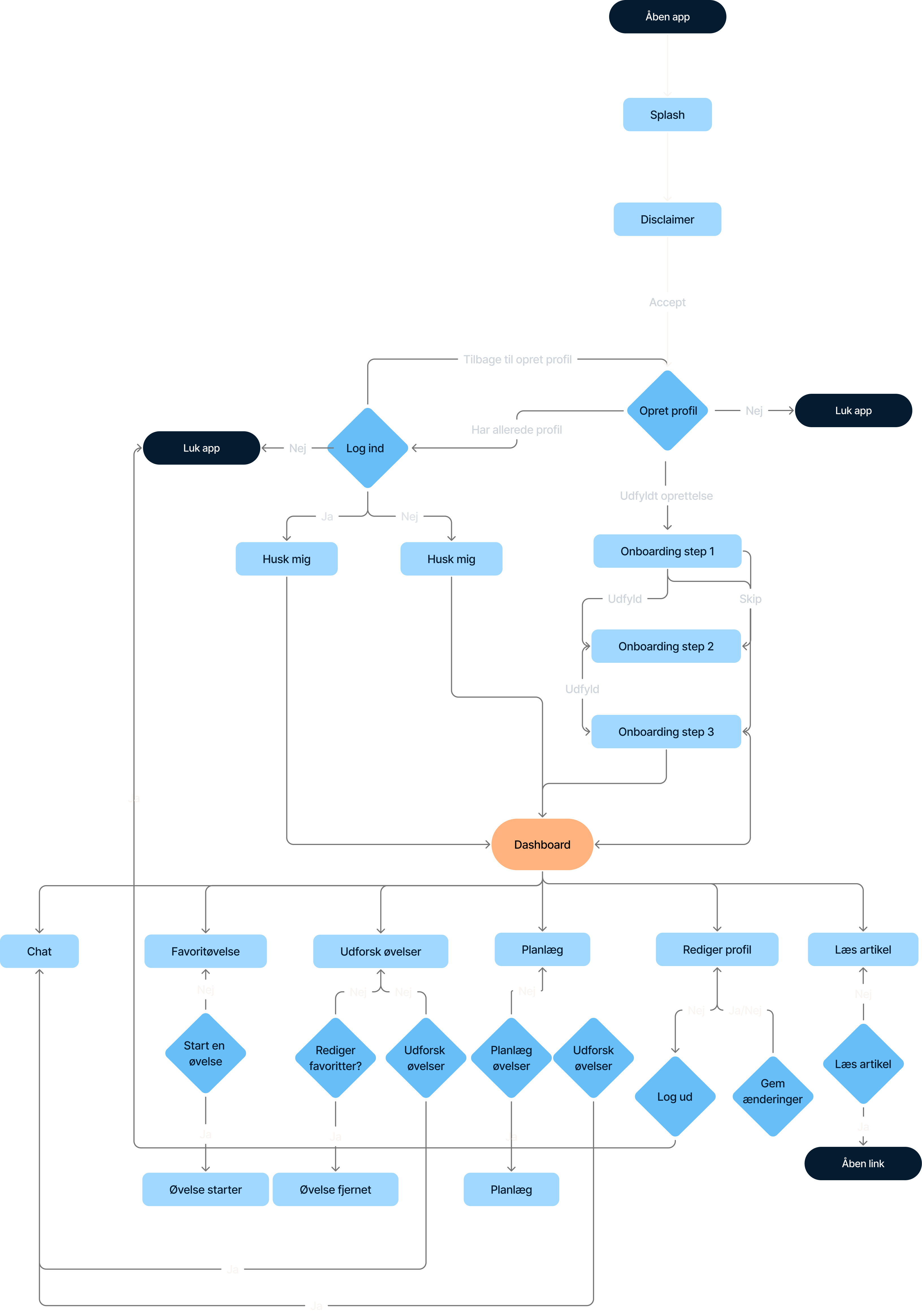
The flowchart mapped the underlying page structure, from the splash screen to the deepest features, ensuring that user flows were logical and coherent without concrete design decisions interfering with the evaluation.

The wireflow combined layout and navigation, creating a shared reference point for discussing and iterating on design decisions across the group.

Flowchart af Whirl-appen
App flowchart — user journey from launch to dashboard
05
Visual Design & Prototype

Hi-fi & Interactive Prototype

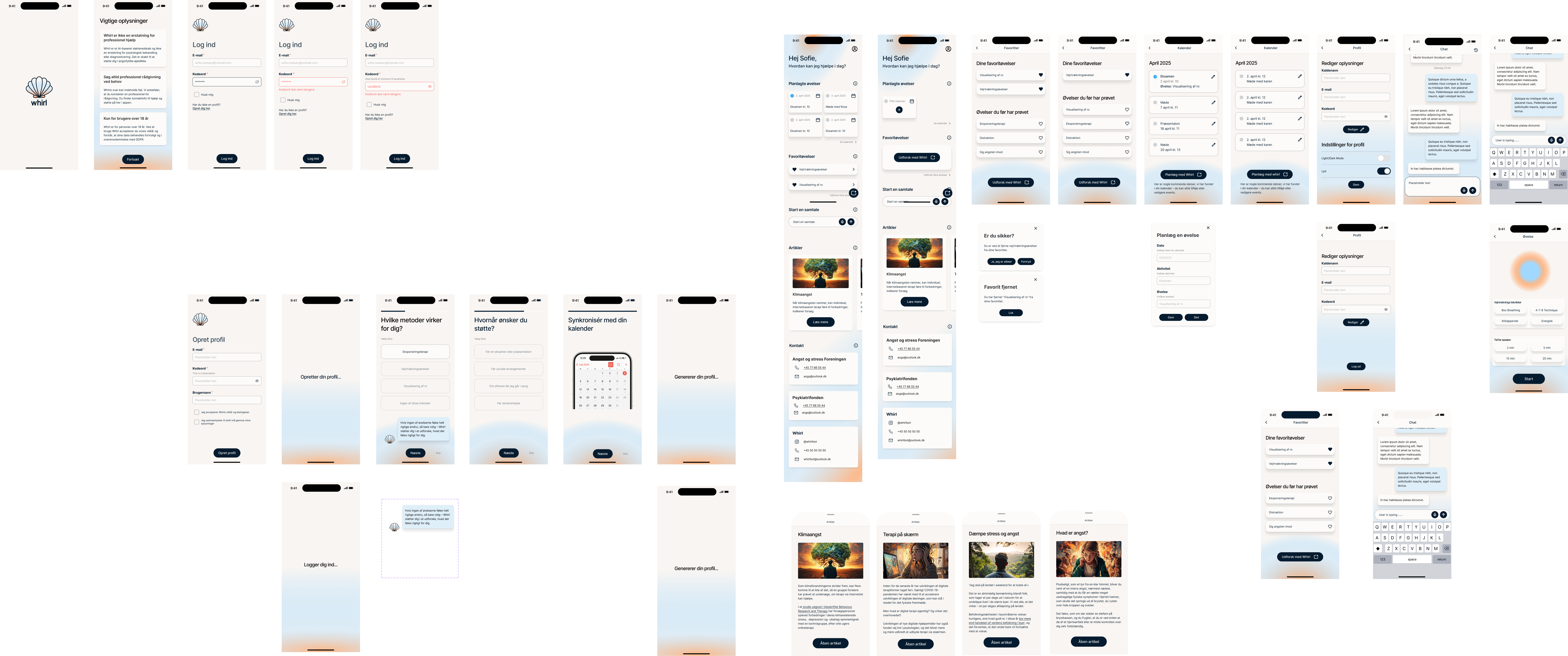
Hi-fi wireframes introduced precise colors, typography, and imagery based on the moodboard and color psychology research. The design system, built with Unity components, semantic variables, and WCAG contrast checks through STARK, ensured consistency and accessibility.

The interactive Figma prototype formed the basis for usability testing. Three users from the target group tested the app through think-aloud sessions. The login flow and calendar UX were revised directly based on the findings.

Prototype af Whirl-appen med alle skærme
Interactive prototype — all app screens combined

App Features

Support, Structure, and Presence in One Place

💬

Supportive Chatbot

A guided conversation using neutral and calming language, developed in collaboration with psychologists. The chat offers reflection and reassurance while clearly communicating that it is not a replacement for professional help.

📅

Planning Tool

Structure and overview are strong anchors against anxiety. Users can plan important dates and tasks directly in the app, helping them stay organized in a demanding everyday life.

🧘

Anxiety Management Exercises

Evidence-based techniques such as 4-7-8 breathing and 5-4-3-2-1 grounding. Save favorites directly on the dashboard for quick access — especially in vulnerable moments.

🌐

Landing Page

A separate landing page with the same tone of voice and visual identity as the app. Optimized for a low CO₂ footprint through image optimization and minimal code, fully responsive across all devices.

See the App in Use

From Sign-Up to Exercise

A walkthrough of the full app experience, from first launch and onboarding to the dashboard, chat, and favorite exercises.

"

It's important for me to be able to find the exercises quickly - you don't have the energy to search when you're already in a vulnerable situation.

User interview respondent, Mia, 20 years old

Ethics & Responsibility

Designing for Vulnerable Users Requires Extra Care

Support, not replacement. Whirl clearly communicates that the app is never a substitute for professional treatment. The chatbot is designed to acknowledge its limitations and never provide diagnosis-like content.

GDPR and data minimization. We continuously asked ourselves: are these pieces of information necessary for the user experience? Personal data is handled according to the principle of collecting as little data as possible.

Inclusion and accessibility. WCAG guidelines were integrated into the design system from the beginning. Contrast ratios and responsive layouts were systematically tested using STARK in Figma.

Free and without ads. Vulnerable users should not be met with distracting advertisements or paywalls. This raised important questions about sustainable funding, a discussion we took seriously.

Reflection

Can Technology and Empathy Go Hand in Hand?

Whirl is our answer: yes, when design is based on users' needs, takes ethics seriously, and involves collaboration with professionals throughout the process. The project is a proof of concept, but it shows that digital design, UX, and ethics can go hand in hand and create real value for people in vulnerable situations.